

The most useless calendar widget is made by Apple. I constantly forget that someone’s birthday or something important is coming up later in the week.
Now I understand that you can set up alerts and you can set up reminders for stuff. I also understand that you can choose a different size widget. But depending on the size and the amount of events it’s possible it won’t even show you what’s going on the next day in the larger widget as well.
This is forced me to use third-party widgets to display calendar events for the week on my home screen. I hate it because I have no idea if it’s stealing my data.
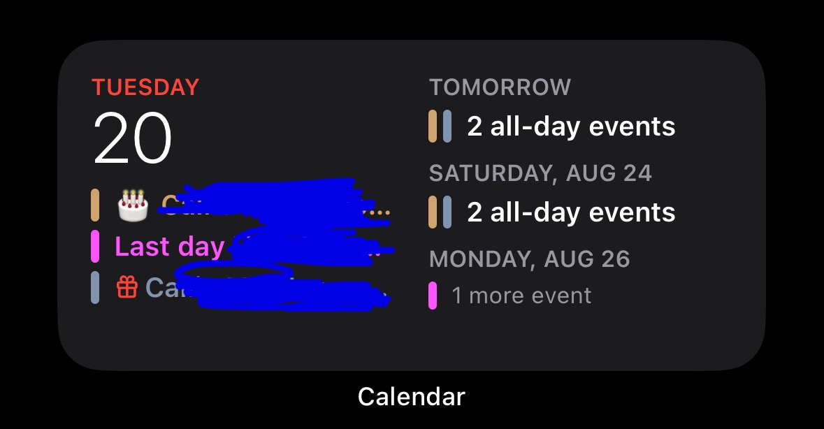
Bonus Edit! The large widget fails to show you what’s happening today!

You must log in or register to comment.
Completely agree, this is garbage, and I’ve bitched about it in the past. Annoyingly, both the Gmail and Outlook widgets are far better, but I don’t want either of those on my phone.
Way too much emphasis on making it look like a calendar app. It should just be a list at that point.
The problem is a lack of emphasis. Apple routinely completely ignores basic features and UXD in their apps, for years. If you don’t want to use an app in the exact rigid structure they want you to, you’re gonna have a bad time.
That’s why I only use a handful of Apple apps — the apps that have no possibility of vendor lock-in, and can be instantly replaced on any other OS (e.g. calculator — which also fuckin sucks for anything beyond basic arithmetic).
Seems normal for apple.
Super pretty yet lacking of the most basic features.
See the calculator that they shipped with iOS in the last 15 years, doesn’t even have history or at least the capacity to hold a single value in memory like the calculators in the 80s
I agree. Luckily the iOS 18 one is a little better.
It still looks terrible IMO.
Edit:
I agree. Luckily the iOS 18 one is a little better.
It’s not differentl. It’s the same as iOS17.
Why it’s terrible.
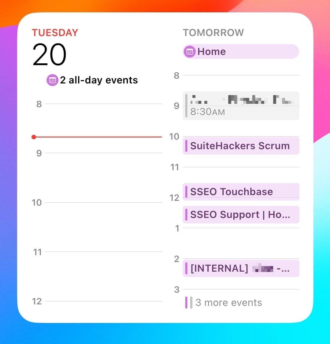
- What are the “2 all-day events”?
- Why is HALF of the widget wasted white space.
- why are there 3 more events if half of the widget is wasted white space.
Edit: I’m familiar with the widget. I don’t need someone explaining to me how to click on a widget. I get it. I also understand it’s different than the one I posted. It’s called “Up Next”.
Despite which one you pick, they’re all poorly designed. It takes up a third of the screen and does a bad job at presenting as much information as possible within reason.
Edit 2: That specific calendar widget you posted from ios18 beta looks exactly the same as it does in ios17. This thread is pointless.
What are the “2 all-day events”?
Tap on it to find out (if this wasn’t an image). I assume there’s a fixed one row of space for an all-day event there. That’s definitely on purpose, considering they even have a toggle switch to completely hide all-day events. Sure, it could be two or up to two elements but that comes at the cost of the detail on the timeline below. They probably considered the timeline to be more important because that changes more often as opposed to the all-day events that only change once per day, and that as a consequence you’re going to check the all-day events once per day (or even just the day before), so you can just tap the widget if you want to see them.
It would be great if it was more customizable in terms of the layout of course, but this is Apple we’re talking about. I’m honestly surprised there’s a toggle switch to completely hide all-day events in the first place.
Why is HALF of the widget wasted white space.
This one’s a timeline, not a list of events unlike the one in your post, and in that time (8-12 today) there are no events, so it’s blank. It’s as much wasted white space as the full calendar view with no events in it.
Personally I have no problem with the calendar widget, but I have to say collapsing today’s all-day events in the list view as in the OP if there’s space left is questionable at best.
deleted by creator
deleted by creator
Having left the platform for 5 years and migrated to Android, been considering migrating back due to Android not showing a promising future.
Playing with iOS again to see if I can tolerate it, it feels like everything is giant font giant icon Duplo Brick UI. Which could very well be why they’re so terrible at space management. Do they realize some people have eyesight? That widget has a terrible amount of wasted space, but then so does most of the OS.
iOS 18 is in beta, which means you should be using the Feedback app to report stuff like this. Apple has actually been very good at responding to me about stuff like this, so I actually encourage you utilize the app.
I’m not running iOS18 beta. I don’t have an app called Feedback. ???
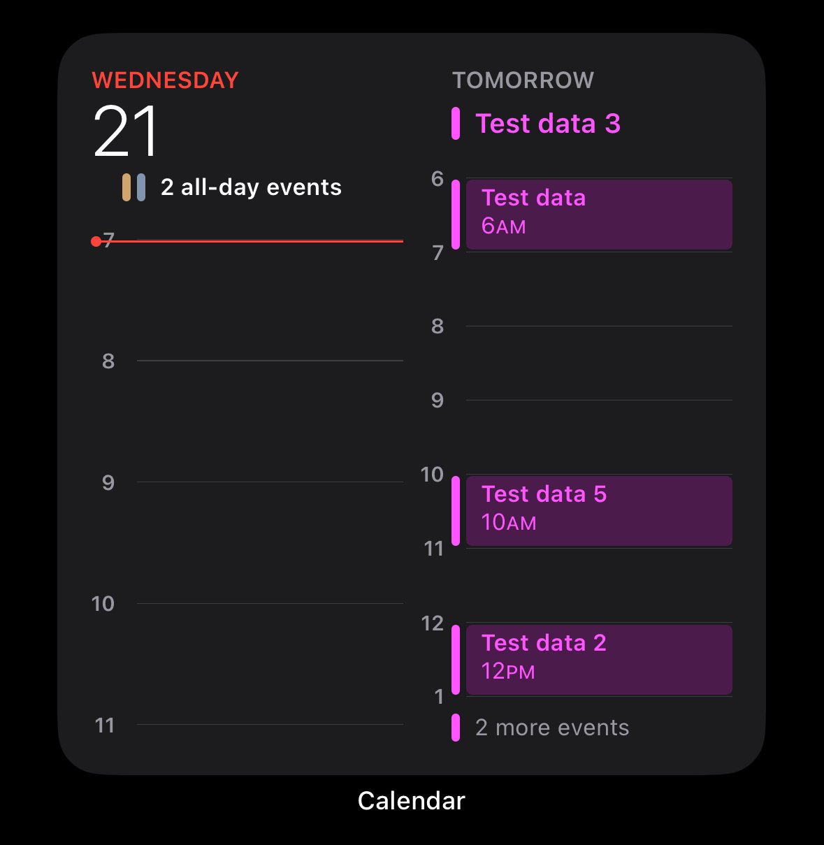
And for the record, the specific calendar widget the user posted from iOS 18 looks exactly the same as the one in iOS 17.
This whole thread is pointless.
Yeah the “whole thread” goes off about iOS 18, so my bad for assuming people were using iOS 18. 😒
Though you’re right, the entire thread is pointless. I’m considering blocking this community because it feels like everyone’s got an attitude problem.
“Please do Apple’s UX work for them, unpaid, of course.”
So you prefer they don’t take any feedback at all so everyone can complain about it and they’re never made aware of the issue. Okay 🙄
They’re made very aware of things on social media, they internally have tools that scrape social media to surface hot issues. They should be leveraging them. They likewise have instrumentation to see how users use every element of the operating system. If they see that widget being installed->deleted, they should have the metrics to drive “something is fundamentally wrong with this thingy.”
The poor cartoon duplo UX is a fundamental design problem. You’re just buying into the whole corpo “hey we do a beta so you get a voice (but actually we’re just lazy and laid off a bunch of QA to crowd-source their job for the lulz)” experience. It should not be the job of the end user to (unpaid) tell the corporation how to do their job.
Posts like OPs are just surfacing an, “I’m annoyed at this dumb thing” user experience. Venting to others is cathartic, corpo should be smart enough to gather this intel. Filing a bug report that could lead to 60 follow-up questions from the corp that they expect you to keep submitting more information and will likely not lead to any meaningful change is just pointless (because it’s unpaid) work that their engineers should be doing.
Although if a person likes to donate their time to the company they already spend thousands of dollars at to improve the product that shouldn’t have been shipped broken, that person should go ahead and do it.
The calander app is a shit show. You used to be able to make a repeating event on specific days of the week. but now you have to make multiple events on those days to repeat weekly. If you dont then it shows like a whole fuckin month of one event. Its also bullshit that there isnt a widget for a full month view. I have to use OneCalander for that. OneCalander
I changed over to using calendar.txt a few months ago, never looked back. So easy to sync.
I don’t understand It anyway - what’s going on in the IT companies that come up with this? Microsoft Outlook isn’t better. In any case, a meaningful view for us “Europeans” is not adjustable: There is either too much useless information at the overviews in these calendars, the wrong information given or way too little. Like this: Week starts at Sunday, Degrees in Celsius, Month-Day-Year Dates and “Yesterday, Tomorrow” as Day description, instead it should be Tuesday 20, Wednesday 21, Friday 22. And not crap like this: Actual day is shortened down and there is Saturday in this view! WHY?
deleted by creator
You’re just salty because you missed that one event at that one place with those specific people. Apple put it in your calendar, how is that not helpful!? /s
EDIT: I was making a dumb joke about how it didn’t show you any details, even if it would take up the same space…
Silly me for thinking the point of the widget was to allow you to see your week at a glance.
Sorry, we’re on the same page! Sarcasm doesn’t come across so well written.
I caught it. Seems others didn’t.
Speaking of “at a glance”… Absolutely hated that feature at first, but now one of my favorite “small thing” about pixels.


